Elegant, timeless and distinctive, serifed Garamond Premier Pro naturally dominates First Republic’s visuals. Reflecting our refined brand qualities, this typeface graces our logotype, headings and other elements to promote a rich brand experience.
Based on vintage Swiss sans serif typography, FRB Neue Haas Unica is a sharper, warmer and cleaner modern hybrid that’s optimized for new technology.


Our fonts may appear in certain approved weights:


Body copy drives the scaling of other typographical elements in a visual presentation, and its size represents “x” in our guidelines. Please refer to the specific rules for standard applications or oversize applications.
Standard applications include web content, social posts, white papers, product sheets, info sheets, internal documents, editorial content, advertising and brochure/booklet covers.
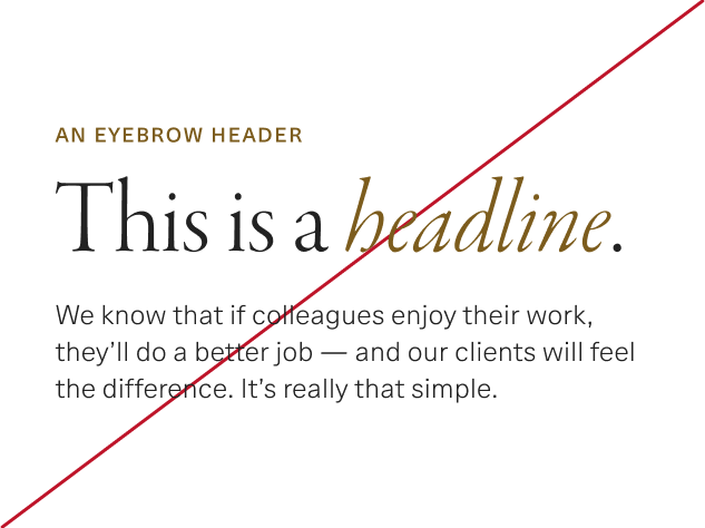
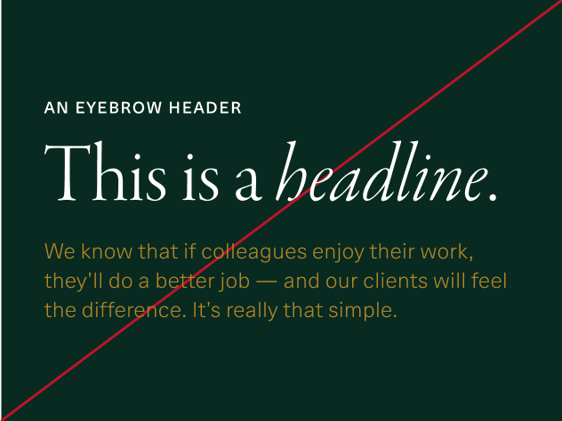
Eyebrow header

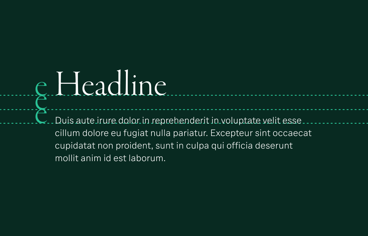
Headlines
Headline 1 (all caps)

Headline 2 (sentence case)

Subheading

Title

Subtitle or oversize body copy

Body copy

Legal copy

*Important: Per Compliance requirements, please ensure font sizes never fall below a minimum of 12px for digital, or 8pt for print applications.
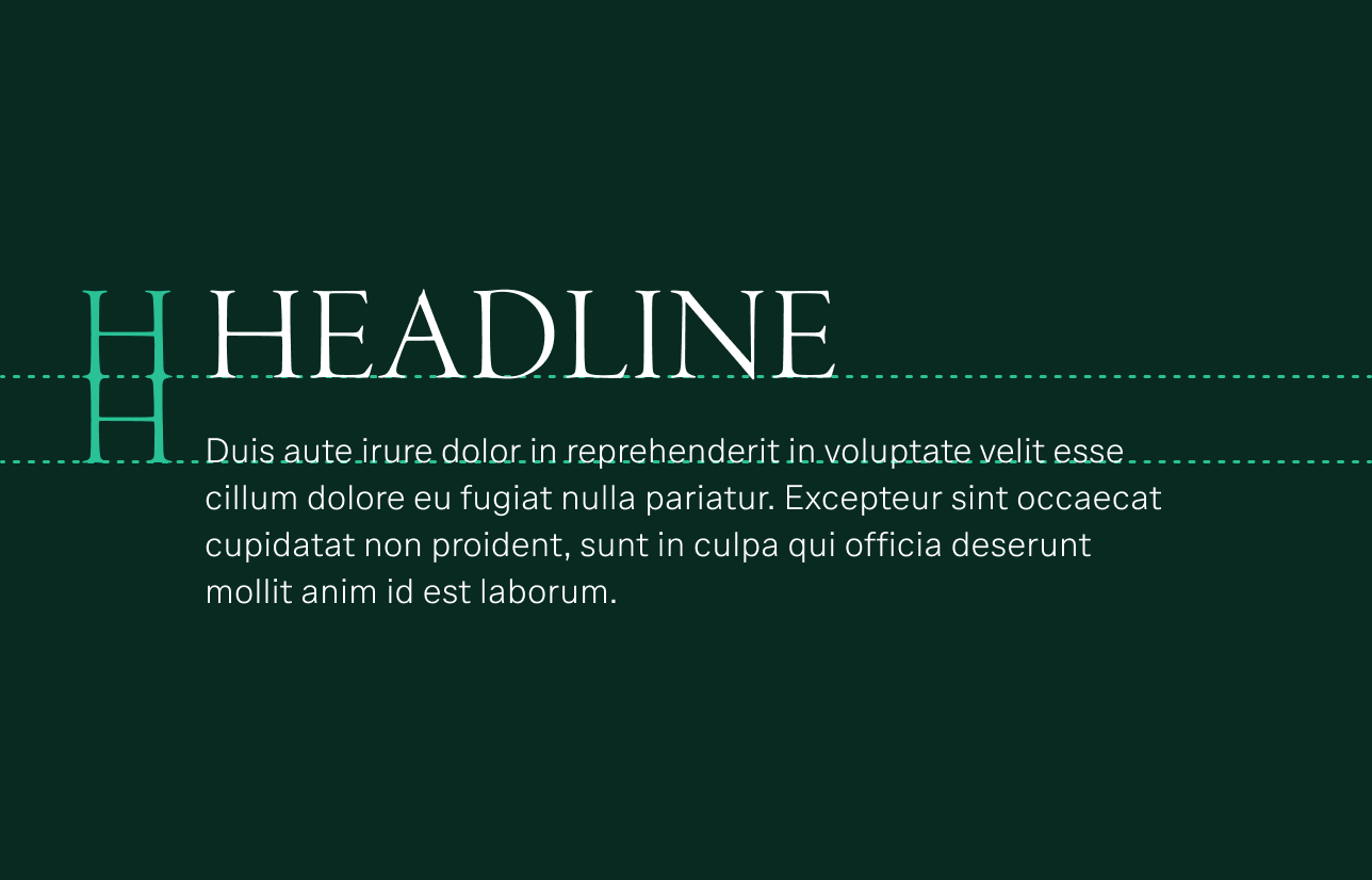
Oversize applications consist of out-of-home advertising, billboards, posters, wall graphics and window clings.
Eyebrow header

Headlines
Headline 1 (all caps)

Headline 2 (sentence case)

Subheading

Title
Subtitle or oversize body copy
Body copy
Legal copy
*Important: Per Compliance requirements, please ensure font sizes never fall below a minimum of 12px for digital, or 8pt for print applications.
Refer to the following examples when using our scaling system:


Our typography colors were selected for their usability and accessibility. Please note that Gold and Bronze should be used sparingly and thoughtfully. For additional guidance, visit our Color page and review the acceptable-use examples below.

Use Bronze as an option.
Apply Bronze for eyebrow type styles on light backgrounds.

Use color with purpose.
Convey emphasis with the use of an approved accent color.

Use a monochromatic scheme.
Use Iron, standard for headlines and required for body copy on light backgrounds, on all type styles in a pairing for a monochromatic look.

Use Gold as an option.
Apply Gold for eyebrow type styles on dark backgrounds in print, but use Cloud in digital to ensure accessibility.

Use color with purpose.
Convey emphasis with the use of an approved accent color.

Use a monochromatic scheme.
Use Cloud, standard for headlines and required for body copy on dark backgrounds, on all type styles in a pairing for a monochromatic look.
The color combinations shown in the swatches below are acceptable with headlines and oversize texts and may be applied in a variety of situations.

Use Iron or Bronze for large text on light backgrounds. Gold is also an option, but not on Sand or Pebble backgrounds. Review all acceptable color combinations using our interactive Color tool.

Use Cloud, Cotton, Sand or Pebble for large text on dark backgrounds. Gold may be used sparingly (three words or less) on backgrounds other than Pine. Review all acceptable color combinations using our interactive Color tool.

In special cases, we use oversize text that falls outside our basic hierarchy. For these instances, use Cloud, Cotton, Sand or Pebble against a dark background, and use Bronze and Iron against a light background.

Don’t repeat Gold or Bronze in multiple levels of a pairing. Color should never overwhelm the user interface.

Don’t use any color other than Cloud for body copy on dark backgrounds.

Don’t highlight body copy with Gold or Bronze. Instead, increase the weight of the font to the next level.
Setting type involves arranging characters in a manner that supports readability, promotes cohesiveness and creates a fitting tempo for the brand experience.
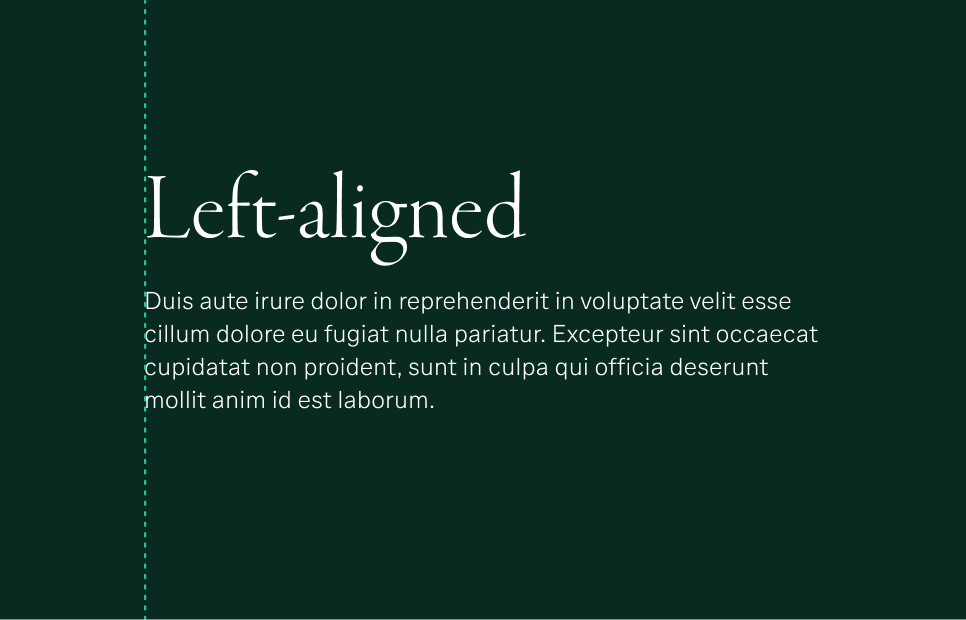
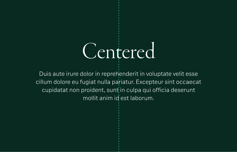
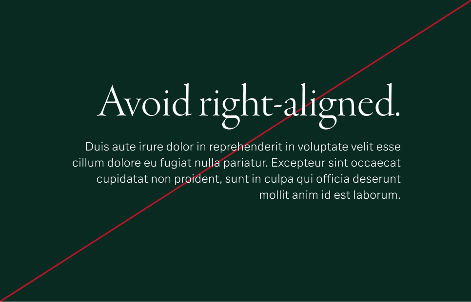
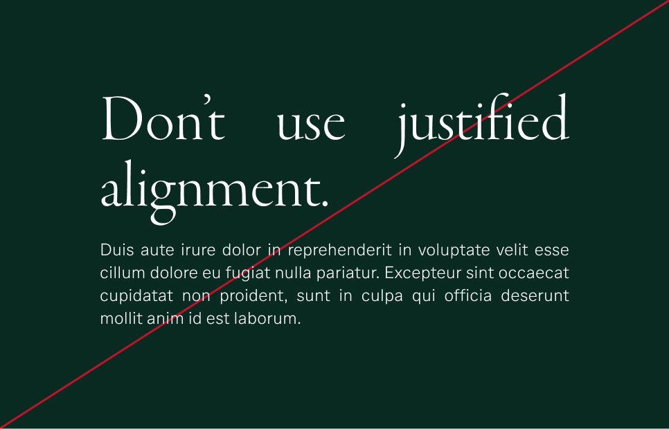
Consistent and correct alignment contributes to a predictable flow of information, helping to guide readers and focus their attention on the messages being conveyed. We favor left-aligned text but occasionally use centered type when it’s better suited to an application’s purpose.

Preferred: Left-aligned
Promote legibility by using left-aligned type whenever possible.

Acceptable: Centered
Draw attention to headings or support interesting composition with centered type.

Don't use right alignment for headlines or body copy.

Don’t use justified alignment in any applications.
Our two headline style options, all caps and sentence case, both appear in Garamond Premier Pro. The all-caps style is harnessed to create impact. Sentence case lends itself to a more subtle approach, such as in instances that feel conversational or straightforward. Sentence case may also be applied when the headline includes proper nouns, such as conference or company names.
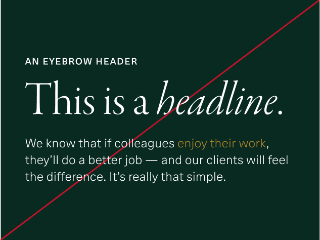
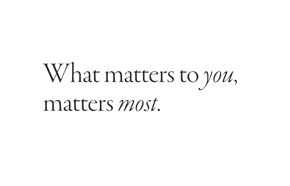
Either headline style may benefit from targeted use of italics to add emphasis. Italics should only be applied to parts of speech that reinforce a message.

Use italics to emphasize key parts of the message.
Keep headlines succinct, and combine Roman and italic type judiciously to elevate meaning.

Don’t mix multiple type treatments.
Use italics, and sparingly, to emphasize key words.

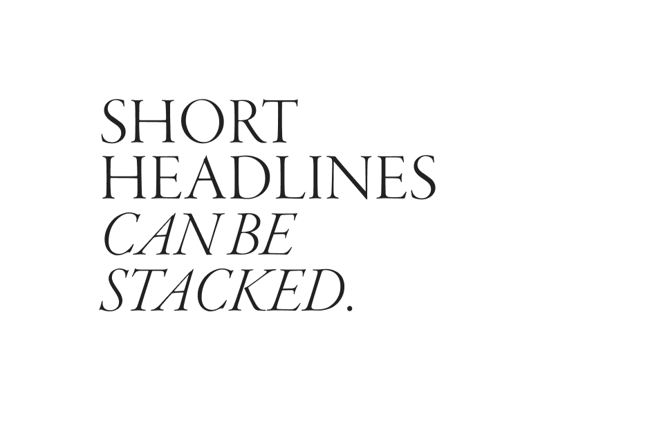
Use stacked caps with italics to add emphasis.
Add strength and emphasis to short headlines with all caps and some italics. Aim for one or two words per line, with a maximum of 32 characters.

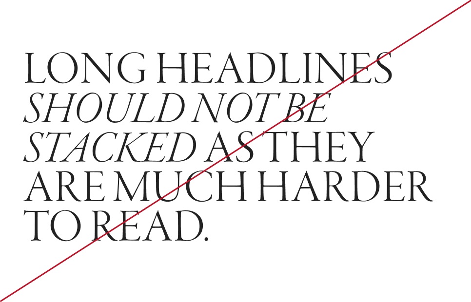
Don’t stack longer headlines.
Avoid stacking all-caps headlines longer than 32 characters, as incorporating too many words and lines will interfere with legibility.
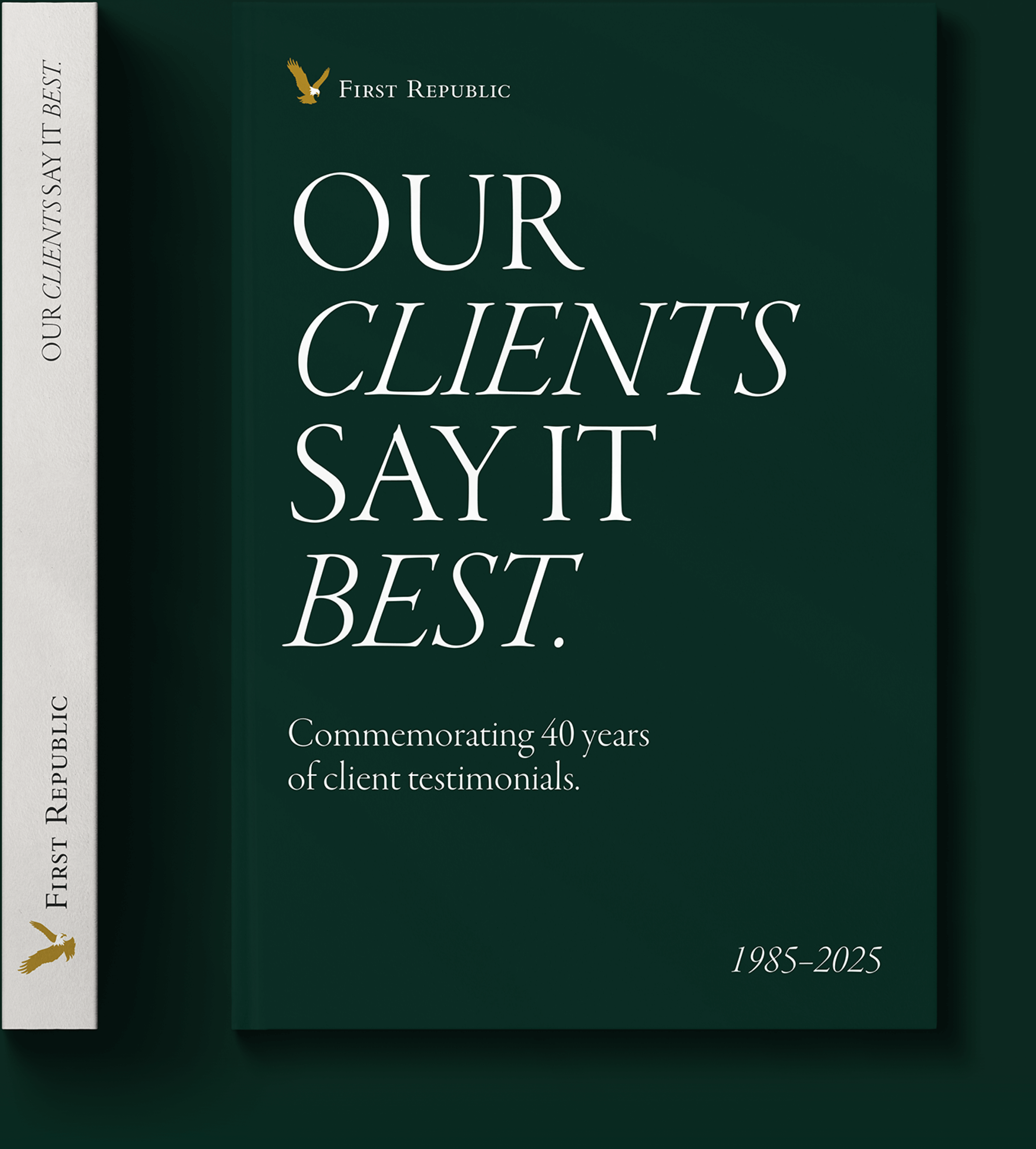
The following example of a headline uses stacked caps and an italicized “Clients” and “Best” for emphasis.
Using all caps in a well-composed arrangement can provide superior readability and communicate strength.

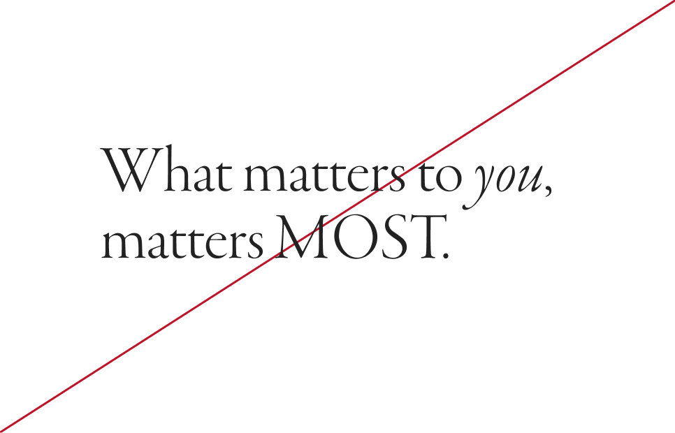
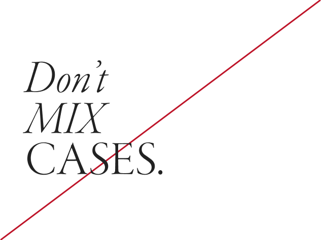
Don’t mix cases in headlines.

Don't use only italics in sentence case, as they should be used to emphasize key words. All-caps headlines may, however, be set entirely in italics.

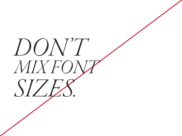
Don’t mix font sizes.
Also known as line spacing or line height, leading is the distance between lines of text, from baseline to baseline. When setting type in print or digital applications, using the correct leading supports optimal legibility.

Why is this optimal?
This leading provides just enough space between each line of text so that the letter forms do not clash.

Why is this too tight?
This leading is too tight because the descender (base of the letter “p”) is clashing with the “G” on the next line.

Why is this too open?
The leading is too open because it is hard to perceive the text as a single headline, disrupting legibility.

Sentence case headlines: Vertical spacing
Use at least twice the height of the headline’s lowercase x-height to create the right amount of spacing between the headline and the body copy.

All-caps headlines: Vertical spacing
At minimum, use the headline’s cap height to position the baseline of the first line of content below the headline.
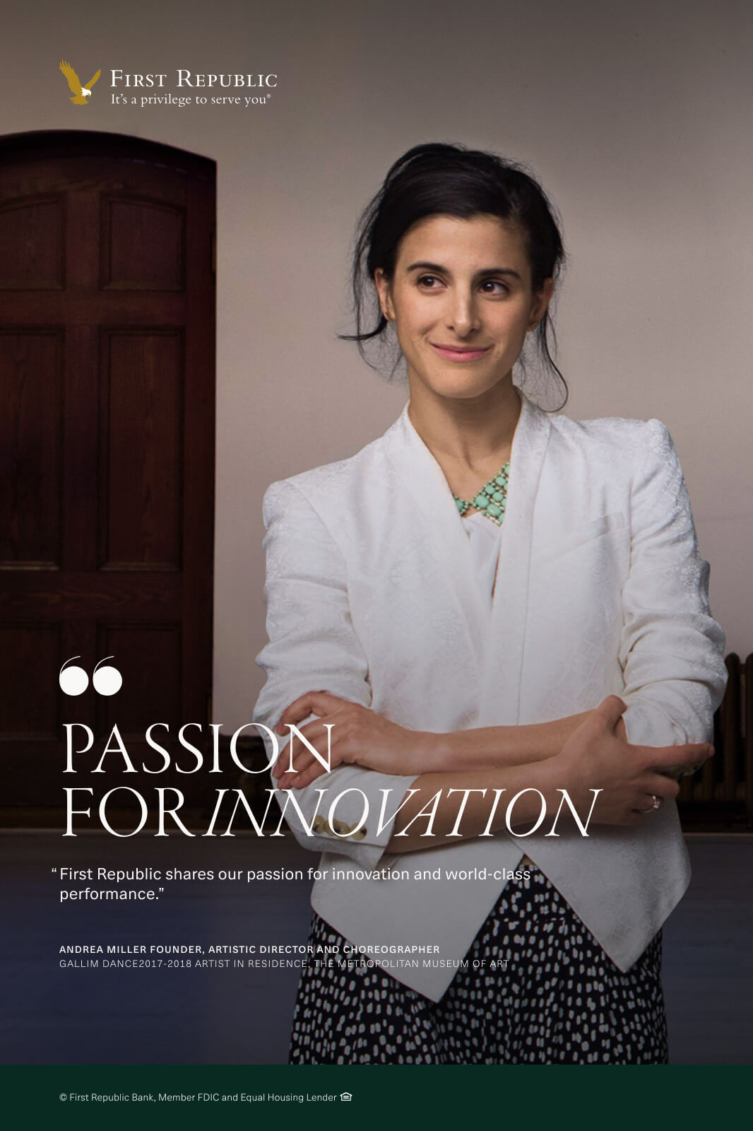
Text may be placed over photography when there is suitable contrast to guarantee full legibility. If ample clear area or contrast is unavailable, use an approved color container as background for messaging.
In this application, the image provides enough contrast to allow text to pop, and background patterns are subdued and do not distract the eye.
This image does not provide enough contrast for text legibility, and the type treatment conflicts with our approved systems.
For social media, be concise with text. Keep characters to a minimum to avoid overpowering an image. We recommend checking your design at its rendered size (using tools like Figma Mirror) to ensure that text is always legible.
Both of these Instagram executions work because they feature succinct messaging, maintain a balanced hierarchy by employing multiple levels of type styles, and are legible across a range of devices.


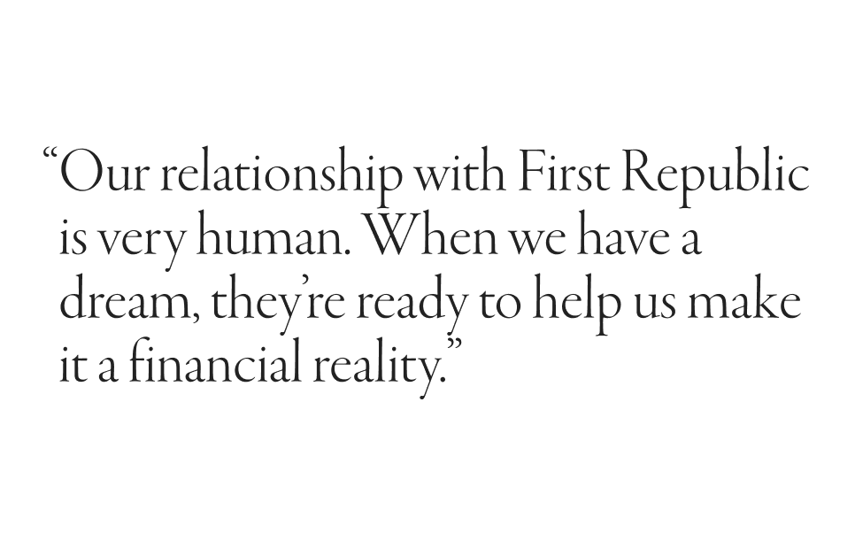
The impact of our brand attributes — personal, humble and refined — comes through most clearly in how our clients relate their First Republic experience. We believe that our clients are among our best brand ambassadors, and we value their thoughtful testimonials. To learn how to develop these important marketing assets, please visit Writing for Testimonials.
Testimonial type can be set in classic form (standard quote marks) or graphic form (graphic quote marks).

Classic quote marks for most cases
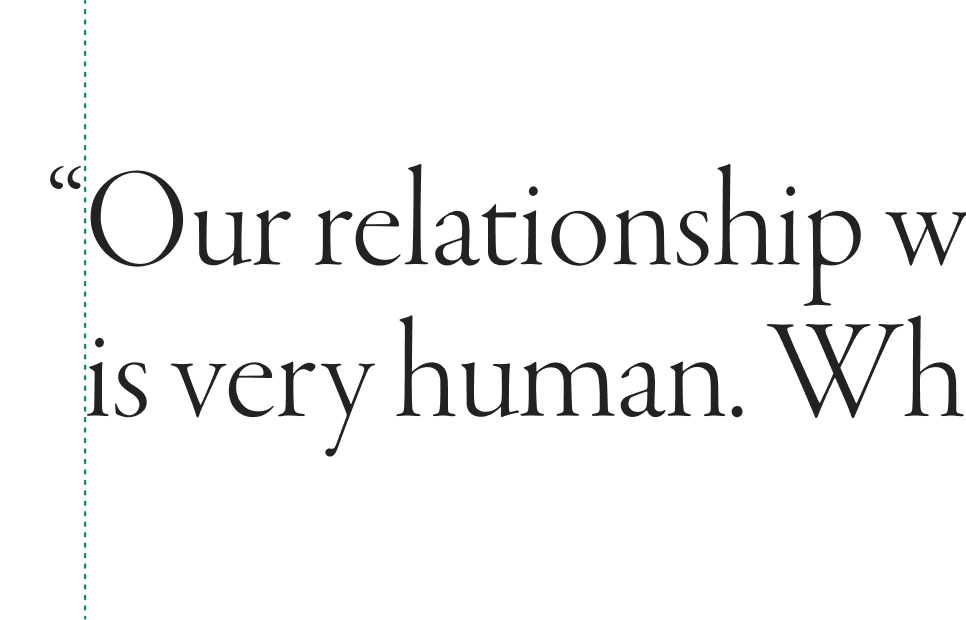
Most often, we set testimonials with standard quotation marks, but we ensure that the initial quote mark overhangs on the left side of the text block whenever possible.

Overhanging punctuation
By setting the initial quote mark to overhang on the left side, we create a more uniform edge for the text block.

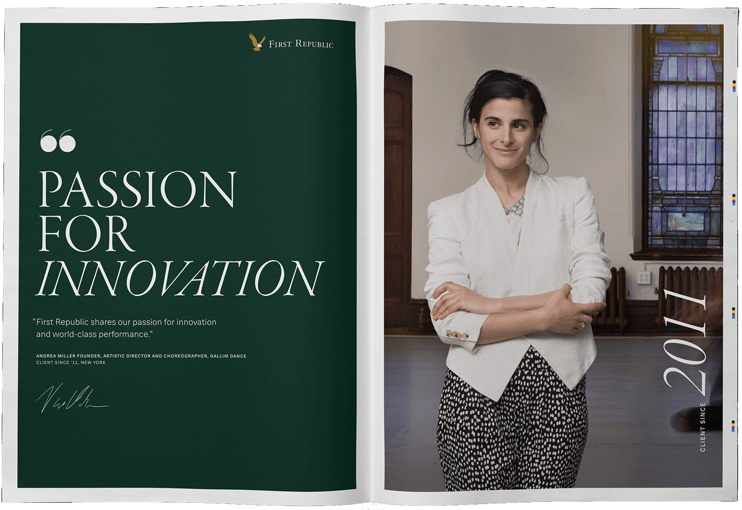
Graphic quote marks for special cases
In less formal situations, we use a graphic quote mark to draw the eye, setting it above the testimonial and applying left alignment with the text block.

Graphic quote marks for extra emphasis
Graphic quote marks may also be used when a portion of a testimonial is called out for extra emphasis.
All testimonial attributions use a consistent treatment in FRB Neue Haas Unica, ensuring legibility at any scale and incorporating hierarchy through two type weights.


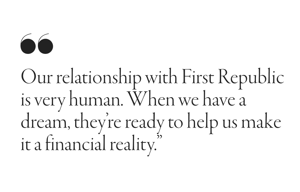
Applying quotation marks and adding attribution creates our signature client testimonials, which are used in a variety of applications to reinforce our brand promise.
x = size of body copy used in application
Quote
4x for oversize applications
2x for standard applications
Attribution
x for oversize applications
0.75x for standard applications


x = size of body copy used in application
Quote
4x for oversize applications
2x for standard applications
Attribution
x for oversize applications
0.75x for standard applications


x = size of body copy used in application
Headline
6x for oversize applications
4x for standard applications
Quote
1.25x (oversize body copy style) recommended for full quote
Attribution
0.75x


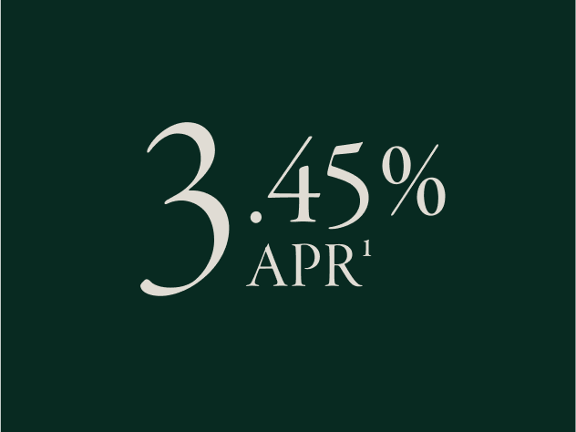
First Republic often promotes lending and savings products by highlighting potentially advantageous annual percentage rates (APRs) and annual percentage yields (APYs). As these terms are treated identically in their lockups, refer to the APR example as a guide for both.
Numerals
4x
Garamond Premier Pro Display Light
Percent symbol
2x
Garamond Premier Pro Display
APR1 / APY1
x = APR type size
Garamond Premier Pro Display


Use this lockup consistently across applications. You can scale the lockup to convey the hierarchy of information.
Numeral before the decimal
4x
Garamond Premier Pro Display Light
Decimal numerals and percent symbol
2x
Garamond Premier Pro Display
APR1 / APY1
x = APR type size
Garamond Premier Pro Display


Use this lockup consistently across applications. You can scale the lockup to convey the hierarchy of information.


Font substitutions may be required in some instances, such as in emails. When our standard fonts are not available, use the following alternatives.
Sometimes it helps to review well-done typography to inspire creativity.