
Color is a powerfully resonant branding tool that allows the designer to go beyond simply sharing information to connect in a way that evokes a response, creates a mood, symbolizes an idea and expresses an emotion.
Calibrated for digital usage, this palette of Pine, Gold, Bronze and Forest offers a variation on our core brand identity colors. And, while screen displays vary, adhering to these formulas will result in better consistency across platform devices.
Our palette range allows for options to increase accessibility. For example, Bronze will often be more legible than Gold in many digital applications.
This palette of Pebble, Sand, Cotton and Cloud provides the opportunity to create an open, neutral-color space. These tones create a pause for the eye amid the richness of our brand colors.
Our elements color palette of Onyx, Iron, Charcoal and Steel represents an array of shades of varying degrees of darkness, allowing for a striking visual contrast in a neutral, monochromatic palette.
Our functional color palette of Grass, Alert, Rock and Concrete is applied to UI elements. Grass indicates action. Alert signals warning, error and other notifications. Rock and Concrete show lines and dividers.
Our main identity colors are Pine and Gold for both spot and 4-color process print applications. Spot PMS color is preferred, but CMYK builds are acceptable if calibrated for coated or uncoated stocks.
In keeping with gold’s rare and precious qualities, Gold Metallic should be used sparingly.
*When printing Pine on uncoated paper, your printer will need to match PMS 3435C. Do not use 3435U.
This palette of Pebble, Sand and Cotton provides the opportunity to create an open, neutral-color space. These tones create a pause for the eye amid the richness of our brand colors.
Our elements color palette of Onyx and Charcoal allows for a striking visual contrast in a neutral, monochromatic palette.
Applied with confidence and care, our unique brand color combinations result in extraordinary clarity and effectiveness. To achieve the desired effect for features such as text and graphics, start by selecting a background color, then incorporate additional hues from our palette.
“If you know your roots, you don’t lose your way.”
James H. Herbert, II
Founder and Executive Chairman
When considering color, some approaches just don’t express our brand as well as they could. Please adhere to the following guidance:

Don’t use background colors outside our brand-approved color palette.

Don’t use Gold as a background color.

Don’t use colors outside our brand-approved color palette for graphical features.

Don’t use shades outside our brand-approved color palette for typography.

Don’t apply text effects to typography, such as introducing transparency.

Don’t use Gold in body text.

Don’t place text against a low-contrast gradient, which could compromise legibility.
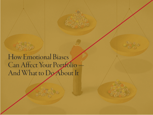
Don’t overlay images or illustrations with a block of color.

Don’t place text in a brand color that does not provide enough contrast with the visual details of our photography.
Be inspired by examples of our curated color selection at work.
