
Our logo comprises three elements: First, our symbol, the Eagle in flight. Then, a wordmark — First Republic — in Bembo caps and small caps. Finally, our tagline, which highlights our dedication to service.
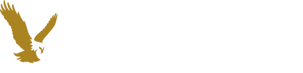
Horizontal lockup
Vertical lockup
Logo elements are locked in place, forming our recognizable
lockups. The First Republic lockups are our default lockups and are available in two balanced and scalable
options: horizontal and vertical.
The horizontal lockup is suited to applications with limited
space, while our vertical lockup stacks and centers all identity elements. Use the logo that best
complements the design and balance of a layout.
Please note that lockups may be used with or
without our brand tagline, but they should never be taken apart or altered.
Although the First Republic logo is the default logo for
our brand and most applications, rare instances may require the First Republic Bank logo. Two balanced and
scalable lockups are available: horizontal and vertical.
The horizontal lockup is suited to
applications with limited space, while our vertical lockup stacks and centers all identity elements. Use
the logo that best complements the design and balance of a layout.
Please note that lockups may be
used with or without our brand tagline, but they should never be taken apart or altered.


Horizontal lockup with tagline
This horizontal lockup
adds our tagline to reinforce our commitment to service.

Horizontal lockup
This arrangement of identity elements
is locked in place for a clean, streamlined look suitable for a variety of applications.


Vertical lockup with tagline
This vertical lockup adds
our tagline to reinforce our commitment to service.

Vertical lockup
In this center-stacked arrangement, the
spacing and placement of the identity elements are locked into place perfectly.
Our tagline emphasizes our values and mission. Include it with our logo whenever space permits to reinforce these essential messages. Note that the tagline must always be accompanied by a registration mark and is not punctuated.
Logo with tagline
Because we consider serving our clients
a privilege, most of our communications use this logo. This version allows us to express the very
essence of our brand.
Logo without tagline
We use this logo in communications
to simply identify First Republic or to accommodate extreme space constraints.
Our iconic brand identity is enhanced and elevated with a flexible system of light and dark background brand colors. Please select from these approved positive and reverse color options.
The preferred First Republic logo is the two-color version, with the symbol in
Gold and both the wordmark and tagline in Black. To ensure legibility, the logo is reproduced on a background
selected from our white space palette of Cloud, Cotton, Sand and Pebble.
For one-color applications,
the logo should be reproduced entirely in Black.

Background / Cloud #FFFFFF
Background / Cotton #F9F8F6
Background / Sand #F0EDE9
Background / Pebble #E0DCD4

One-color applications
For one-color applications of the
positive signature, the logo must be reproduced entirely in Black, as no other color is acceptable.

Print applications
For print applications, the Eagle may
be printed in Gold Metallic ink.
Please review
our Color section for
additional guidance.
As an alternative, the First Republic logo may be reproduced on a
Forest or Pine background. The two-color version uses Gold for the symbol and Cloud for the wordmark and
tagline.
For black-and-white applications, the wordmark and tagline are White with the symbol converted
to 50% Black.
Background / Forest #082A21
Background / Pine #0A382B

Black-and-white applications
When reproducing the
signature as a reverse in black and white, the Gold is converted to 50% Black.
Print applications
For print applications, the Eagle may
be printed in Gold Metallic ink. Please review
our Color section for additional guidance.
Perhaps the single most identifiable aspect of our brand, the Eagle is our
unique symbol and is included in everything we produce.
Careful consideration should be given to
placement, prominence and treatment each time the Eagle is applied.
When used alone, the Eagle should be set off with ample and proportional clear space on all sides. Clear space should be equivalent to 1/4 of the Eagle’s height (x).
In PowerPoint presentations, the Eagle may be used alone once it has been presented within a logo lockup on the title page. On the inside pages, the symbol should be positioned in the bottom left corner.
The symbol may appear cropped only in social applications where size and legibility are constraints.
Social Media — circle containers
Social Media — square containers
Favicon
Using approved logos and lockups creates a consistent, proprietary and memorable identity for First Republic. It also communicates our distinct personality and publicizes ownership in all branding efforts.
To maximize our logo’s visibility and impact, a specific amount of open blank space — or clearance — must appear on all sides of our logo lockups in all use cases. Clearance should be equivalent to the height of the First Republic “F” (x).
To preserve the clarity and integrity of the First Republic logos, always follow
the minimum size requirements outlined below for lockups. Note that minimum sizes are based on logo
height.
The proportions of the symbol, wordmark and tagline must stay consistent. It is critical that
these elements never be sized separately and that they enlarge and reduce as a group.
We strive to present our brand consistently across all applications, and this
concept extends to where our logo is positioned. A uniform logo position communicates hierarchy, conveys
stability and enables discoverability.
We offer three tiers of logo positioning: primary preferred,
secondary preferred and acceptable alternatives. Please use the primary preferred position whenever possible.
In most cases, our
preference is to position the logo at the top left of a communication.
In this particular instance,
use the horizontal lockup.
You may also position
the logo at the top center of a communication.
Use either the horizontal or vertical lockup,
whichever fits the composition best.
In rare situations, alternative positioning may be required to ensure the integrity and legibility of our logo.
Bottom left
Bottom center
Bottom right
Top right
In this preferred position, the logo appears at the upper left corner of the communication. It is set within the margins and with appropriate clearance.
In this preferred position, the logo appears centered along the top of a communication. The composition dictates whether the vertical or horizontal lockup strikes the right balance.
The First Republic logos should not be altered or changed in any way. To ensure adherence to our brand standards, always use the colors, configurations and scale parameters specified in these guidelines.
Don’t alter the proportions of the logo elements.
Don’t change or alter the typeface.
Don’t change the colors of the logo.
Don’t use drop shadows.
Don’t place the logo on a background outside First Republic’s color palette (please refer to Colors above).
Don’t outline the logo.
Don’t ungroup or reposition any of the logo elements.
Don’t rotate the logo.
Don’t distort the logo.
For inspiration, consider this example of our logo in use.


