Loading

Origins

Iconography

Drag

1 / 5

Iconography

Elegantly crafted to encapsulate First Republic’s spirit of service, integrity and respect, our distinctive icons augment the brand experience, enriching narratives and guiding user actions.

Hi-fi
Icons

My striking quality is intentionally designed to foster strong connections, enhance presentations and create compelling narratives. Turn to me when you need a refined, expressive set of hi-fi symbols as I am a powerful communication tool here at your disposal.

System
Icons

App & Website Only

Deceptively simple, my stylized system icons serve as wayfinders on First Republic apps and the website. Rely on me whenever you need to confidently and intuitively guide a client through their financial journey.

Hi-Fi Icons

My striking quality is intentionally designed to foster strong connections, enhance presentations and create compelling narratives. Turn to me when you need a...

...refined, expressive set of hi-fi symbols as I am a powerful communication tool here at your disposal.

System Icons

(App & Website Only)

Deceptively simple, my stylized system icons serve as wayfinders on First Republic apps and the website. Rely on me whenever you need to confidently and...

...intuitively guide a client through their financial journey.

Icon Library

Hi-Fi

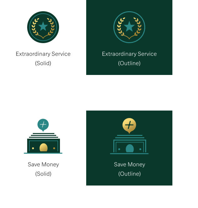
Our library of hi-fi icons comprises unique silhouettes that speak to our abiding brand behaviors — personal, humble and refined. You’ll see their full integrity on light backgrounds with the solid effect and on dark backgrounds featuring a dramatic outline effect.

All Hi-Fi Icons
Background
Light
Dark
{{currentPage+1}} / {{numPages}}

Don’t see a hi-fi icon specific to your needs? Use an icon with a similar purpose.

For assistance with selection, or to request a new icon, contact the Brand Team.

Design Principles

First Republic icons add character, craftsmanship and care to our portfolio of products and services. Adhering to these principles will help to maintain a strong and consistent aesthetic.

Our Icons
are Always

Friendly & inviting

Partnership, human connection and personal touch radiate from our icons. The trust that results must be rewarded with every interaction.

Crafted & refined

These elegant, unique silhouettes have an ownable style, with every detail exuding a tangible sense of craftsmanship and quality.

Positive & optimistic

Confident and clear, our icons convey a sense of security and commitment while reflecting the positive, long-lasting relationships we cultivate with our clients.

Clean & legible

Simple, easy to decipher and accessible, our icons clearly communicate the action a client needs to take when interacting with First Republic’s products and services.

Our Icons
are Never

Sterile or generic

Our icons never lack emotion or personality. Instead, their unique character distinguishes them in the marketplace.

Alternative in style

Our icons never deviate from the selected style but maintain a consistent visual aesthetic across system and hi-fi families.

Dull or uninspiring

Never monotonous or unimaginative, our icons are positive, intriguing, relatable and actionable.

Overengineered

Our icons are never overly complicated, confusing or fussy. Instead, they are clean, simple and comprehendible.

Our Hi-Fi Style

We rely on core qualities that guide the crafting of our First Republic iconography library. Every metaphor, shape, form, line, color, angle and detail has been carefully considered to generate imagery that reflects our brand behaviors.

Metaphor
Angle
Shape and Form
Line Weight
Detailing
Characteristics
Choosing metaphors that are friendly, inviting and easy to read is key to communicating effectively.

What’s more, our icons veer away from generic banking stereotypes and embrace unique qualities that reflect the unparalleled experience of our extraordinary service.
Our icon sets use various recurring angles, which support legibility at smaller sizes. These angles also promote recognition and connection among both hi-fi and system sets.
Designed to sit comfortably alongside all other brand components, icons must achieve the perfect equilibrium between positive and negative space.

The primary rule is to render all identical shapes using the same consistent values, to help build a sense of continuity and familiarity.
Outlined hi-fi icons use a 2-pixel stroke for main outer shapes, while a lighter 1.2-pixel stroke is applied to all positive inner and supporting detail. Note that “positive” refers to strokes rendered in Pine or Glacier.

Lighter strokes are then combined with smaller solid shapes, creating a dynamic style with a distinctive weight.
A solid hi-fi icon’s dominant shape in Pine becomes the main body of its outline variant. Elements creating negative space are “punched out” from the shape beneath and defined with a 2-pixel stroke that is, when possible, aligned to the grid. Simplified details promote a lighter feel.

The resulting outline icon avoids optical distortion and retains its proportion, legibility and meaning.
Our icons feature unique, highly crafted styling and “serifed” details that pay homage to one of our brand fonts, Garamond Premier Pro.

By balancing lighter and darker detailing, we are able to consistently create assets that evoke our aesthetic.
Metaphors

Choosing metaphors that are friendly, inviting and easy to read is key to communicating effectively. Our icons embrace unique qualities that reflect the experience of our extraordinary service.

Angles

Our icon sets use various recurring angles, which support legibility at smaller sizes. These angles also promote recognition and connection among both hi-fi and system sets.

Shape and form

Designed to complement other brand components, icons must balance positive and negative space. We render identical shapes using the same consistent values to achieve continuity and familiarity.

Line Weight

Outlined hi-fi icons use a 2-pixel stroke for main outer shapes and a 1.2-pixel stroke for inner and supporting detail. Combining lighter strokes with smaller solid shapes creates a dynamic style.

Detailing

A solid hi-fi icon’s dominant shape in Pine is the main body of its outline variant, and a 2-pixel stroke defines elements creating negative space. These icons retain their proportion, legibility and meaning.

characteristics

Our icons feature highly crafted styling and “serifed” details that pay homage to Garamond Premier Pro, a brand font. We also balance lighter and darker detailing to create assets that evoke our aesthetic.

Color palette

Medium
Digital
Print
Background
Light
Dark

Against a light background, a palette of Pine, Glacier and Aqua is touched with Gold Metallic.

Against a dark background, Glacier is accented with Gold Metallic to highlight key elements.

Pine
#0A382B
Glacier
#2B8686
Aqua
#C2D9D3
Gold
Metallic
Glacier
#2B8686
Gold
Metallic
Medium
Digital
Print
Background
Light
Dark
Pine
#0A382B
Glacier
#2B8686
Aqua
#C2D9D3
Gold
Metallic
Glacier
#2B8686
Gold
Metallic
Hi-Fi Outline

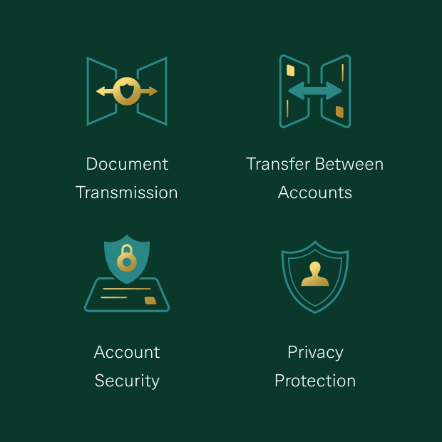
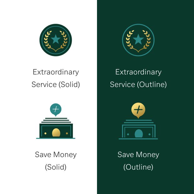
Use outline icons on dark backgrounds.


DaRK bACKGrOUND | fOREST
Hi-Fi Solid

Use solid icons on light backgrounds.

Important: For emails, use hi-fi outline form only, regardless of background (see example).
Light bACKGrOUND | Cloud

Icon grid

For consistency, each hi-fi icon is designed and centered within a grid of 84 x 84 pixels. A smaller inner “focal zone” of 72 x 72 pixels helps set the proportions of the shapes, but it does not dictate the baselines.

Sizes

Designed with consideration for digital use, our hi-fi icons may be applied in any of four approved sizes: 84, 72, 64 and 56 pixels. For guidance on and approval of alternative sizing to accommodate print and digital applications, contact the Brand Team.

84 × 84 @ 100%
72 × 72 @ 100%
64 × 64 @ 100%
56 × 56 @ 100%

Placement

Positioning an icon correctly preserves its integrity and legibility while maintaining harmony with other brand elements. Our rules use the height (x) of a headline’s boundary box and the width (y) of an icon’s boundary box as reference points.

Left Aligned

Text and the left edge of the icon’s boundary box must be snug against a straight vertical line, as shown. Use space of 1/3x to 1/2x between the top of the headline’s boundary box and the icon’s baseline.

Center Aligned

The horizontal center point of text and an icon should line up on an axis, as indicated. Use space equivalent to 1/3x to 1/2x to separate the top of the headline’s boundary box from the icon’s baseline.

Left Overhang

Line up the top edge of the icon boundary box with the top edge of the headline’s boundary box. Use space of 1/4y to 1/3y between the right edge of the icon’s boundary box and the left edge of text, as shown.

Multiple Icons

Ensure that multiple icons are equally distributed as well as center aligned with corresponding text below. Use space of 1/3x to 1/2x between the top of the headline’s boundary box and an icon’s baseline.

Don’ts

Never alter the proportions or visual details of First Republic’s icons, which could compromise their integrity and consistency.

Do not resize a hi-fi icon smaller than 56 pixels when the detail is hard to discern.

Do not modify icon strokes.

Do not modify icon details.

Do not distort an icon.

Do not modify icon colors.

Do not place an outline icon against a light background except when using icons in emails.

Do not place a solid icon against a dark background.

Do not place an icon against a shade that is not part of First Republic’s color palette.

Do not place an icon inside a shape.

Application

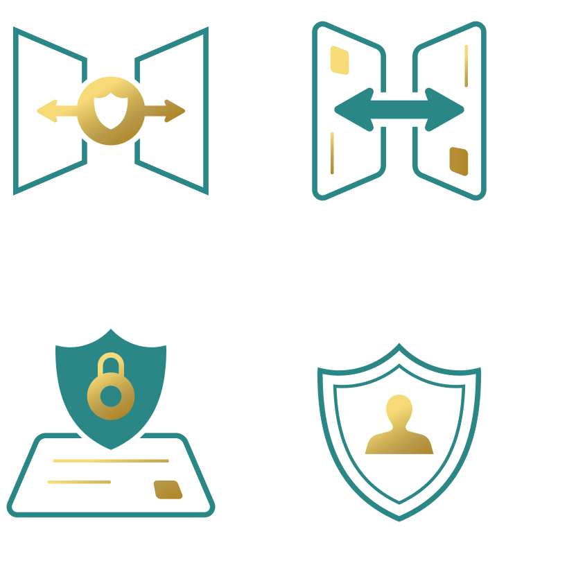
Our family of hi-fi icons has a wide range of applications across both print and digital platforms:

  • Website / landing pages
  • PowerPoint presentations
  • Emails
  • Apps and web apps
  • Social media
  • Print
  • Apps and web apps
Website / Landing Pages

Icons are used on our website to communicate products and features.

Powerpoint presentations

Our icons appear in PowerPoint presentations to support content and add interest to engage audiences.

Alternative sizing may be used in PowerPoint, as shown. For guidance and approval, contact the Brand Team.

emails

Icons serve as visual indicators that help recipients quickly absorb email communications.

Always use hi-fi outline form for emails, as shown.

Icon Library

System
(App & Web only)

Exclusively created for our apps and website, system icons provide clear direction while embodying our personal, humble and refined brand behaviors and reflect the fine detail of our elegant Garamond Premier Pro font.

{{currentPage+1}} / {{numPages}}

Have questions or feedback?